

If you’ve been reading our work for sometime, you know that we’re the first to act when there’s a potential edge in the quantitative trading space.
For a long time, we primarily just wrote up what we found, ran some tests, and shared the code for you to deploy verify it for yourself.
What we haven’t done as much though is actually go back and show you how the strategies we produce and cover have actually performed since release.
So, I took the week to fully organize every strategy, model, and dataset we publish at Alphanume to show you the actual results, for good and for bad.
The momentum index
Starting off strong, the momentum basket returned +82.5% over the last twelve months, against +20.4% for SPY (chart below).
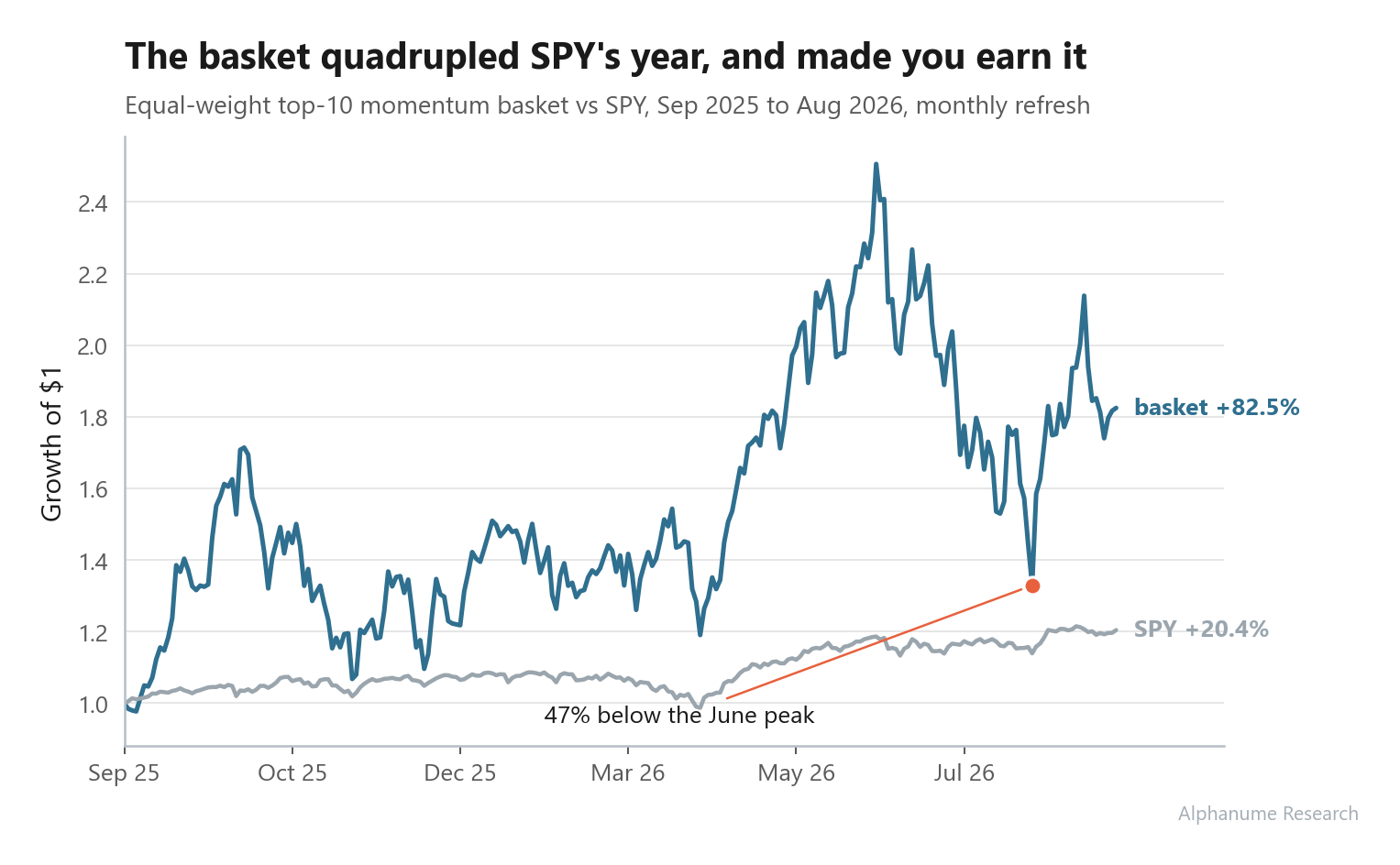
The strategy itself is about as simple as this business gets. Each month we publish the ten highest-momentum US names by the classic 12-1 measure (and a few other risk-adjusted metrics), you hold them equal weight, and you swap the list at the next refresh.
What makes our approach work as opposed to “just buy what’s up” is the universe selection of only those with deep option liquidity at their point-in-time snapshot.
Now, again, we said we’d be completely honest here, so it’s important to admit that the ride was awful at times. The basket fell 47% peak-to-trough between the June high and early August, with July alone down ~-20%.
To be fair though, almost every quant fund with momentum exposure suffered the same fate over that time period:

High volatility comes with the territory of running concentrated exposure to a factor, but it’s called a factor premium for a reason, as you typically end up outperforming standard index beta.
Shorting bad corporate news
While we do consider ourselves good people, this is honestly our favorite class of strategy.
In the majority of cases, when a poorly performing company announces they’ve done something “bad” (e.g., diluting their shares, missed a payment, etc.), forward returns continue to be negative, even after the information is known.
It’s a pretty linear trade with a 1:1 rationale that almost anyone can understand.
Every strategy in this family isolates a company on one of the worst days of its life: an S-1 that registers a pile of new shares, a shady SPAC that just completed its merger, an 8-K admitting a missed debt payment, etc.
Simply shorting these has results that are pretty easy to predict:
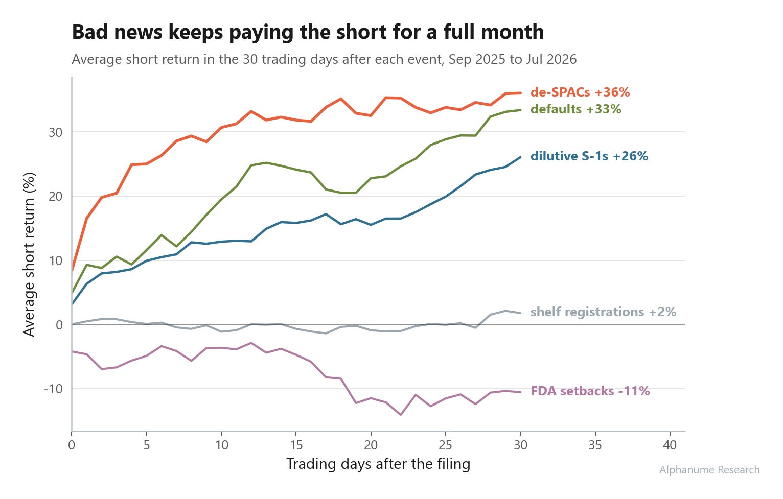
De-SPAC completions: mean 30-day short return +36%, hit rate 83% (of 18 tradeable completions this year).
Corporate default disclosures: +33%, hit rate 87%. Only 15 of 58 flagged names were still tradeable though, as by the time a default hits an 8-K, like Luminar’s bankruptcy filing in December, trading has often stopped.
Dilutive S-1 filings: +26%, hit rate 82% across 170 events, and the micro-cap slice (under $50M) did +30%.
The visual below demonstrates the average short-return path for each event type over the 30 days after the filing:
Now, before you go short every dilutive S-1 that comes, you should know about the biggest reason most funds don’t short sell at all:
One dilution short (
HCWB) lost 283% when the stock squeezed 3x in a weekThis inherent left-tail nature of a short position (max gain is 100%, max loss is infinite) makes scaling incredibly hard.
To make this work at scale, your size per name has to be a tiny portion of your gross book, since its inevitable that at least one name per quarter will have an adverse 5 standard deviation move against you.
The challenge is that for the actual dollar returns to be worthwhile, you’d need a pretty big book to keep risk sane.
The 0-DTE Strike Band
Each morning we publish a lower and upper strike for SPX, which represents the range the index is expected to finish inside that day.
The obvious trade is an iron condor with the short strikes at or beyond the band, so that’s the one we’ll focus on.
Over the last 246 trading days:
SPX closed inside the band 87.8% of the time.
The full intraday range stayed inside only 65% of the time, so if your short strikes sit right at the band, you’ll watch them get touched a lot more often than they actually get breached at the close.
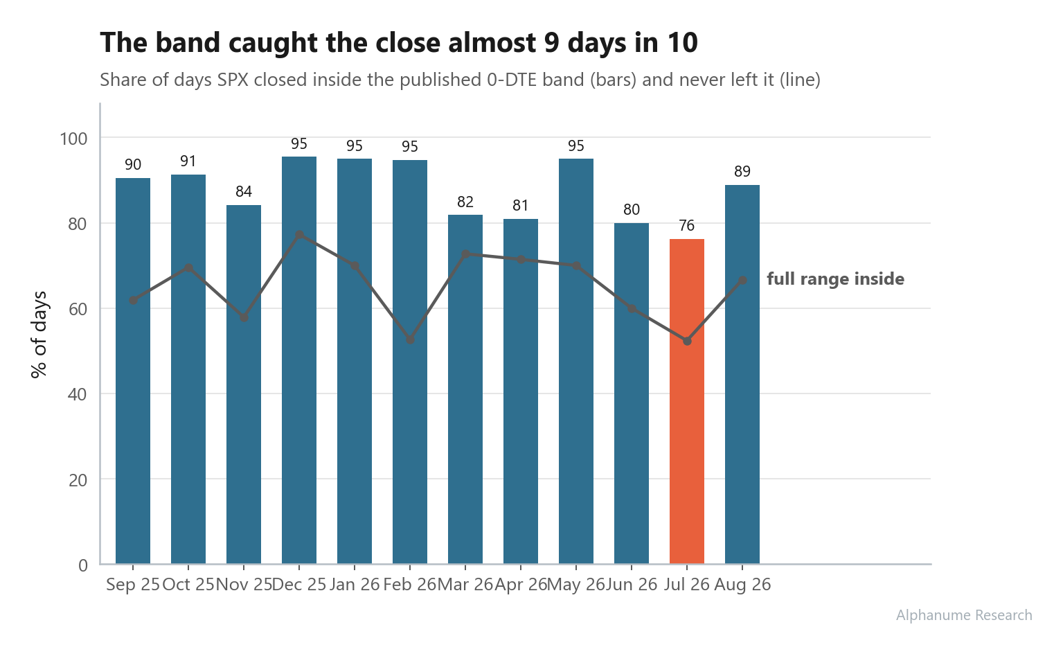
Because this is such a sensitive trade, we make the data for this P.I.T. integral, meaning we never retroactively change the data after it’s been published. So, the outputs you see here are the actual outputs that were visible on that exact day.
Continuing to be transparent, while making some infrastructure changes in July, we had almost a full week where the strikes delivered were modeled on delayed data points which led to erroneous values that brought down July’s average.
Nevertheless, this is one of our more regime-agnostic strategy sleeves that produces a rather steady flow of option premium. It being short volatility still leaves it susceptible to the left-tail drawdown days, but when run as 1 overlay in a multi-strategy book and paired with dynamic sizing criteria, things tend to work out pretty well.
Side note: For those who beared through the intermittent issues and are still with us, thank you and it does not go un-appreciated.
Next-day movers
This feed lists five names before close that our volatility model expects to move substantially in the next session.
Across 1,240 model predictions, the average absolute next-day move was 7.1%, and a quarter of the signals moved 10% or more. The best call of the year was OPEN, flagged the evening before it moved +78%.
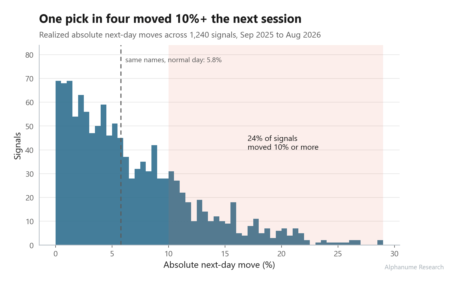
For context, those same tickers move about 5.8% on a normal day (these are wild names to begin with) and SPY moves ~0.6%. So the model’s real skill is picking which day an already-jumpy name goes, which is exactly what you want if you’re buying vol or convexity on the list.
One more for the vol crowd while we’re here: across 1,329 earnings events in the window, the pre-earnings straddle was overpriced 66% of the time, with an average implied move of 8.9% against a realized 7.5%, so selling the earnings straddle still got paid on average.
What didn’t work
Now, in this space especially, if someone says they have a 100% success rate, you would be right to immediately distrust them.
The same applies to us, so let’s take a look at what hasn’t performed that well:
Shelf registrations came back flat: +1.8% mean short return and a 57% hit rate across 346 filings
A shelf just reserves the right to sell shares later, sometimes years later, so the market prices it that way. In contrast, a dilutive S-1 often implies that shares are trying to be sold right now.
FDA setbacks actively lost money: -10.6% mean, 40% hit rate.
A CRL or clinical hold is essentially “something bad happened with the drug” for biotech stocks. What we found is that over the sample, these are priced-in pretty quickly, so even shorting on a t+1 basis is too slow.
This may be a “skill issue”, as we can likely try harder to create a faster data source for these kind of events.
Now, one that wasn’t a failure, but is still too uncertain to call it a success was Wikipedia attention.
We track daily Wikipedia page views for every covered company and flag spikes of 3+ standard deviations above the trailing month.
Our first idea was the obvious trade of mean-reversion of the spike and waiting 30 days. Interestingly enough, that lost ~1.7% on average across 1,678 spikes. Raising the bar to 5, 10, or even 20 standard deviations didn’t help either, as once you subtract SPY the forward return of a spike is basically zero at every threshold.
Still though, I firmly believed that such an uncorrelated metric of “who’s paying attention to stock X right now” wasn’t completely worthless, so eventually I just tried doing the opposite:
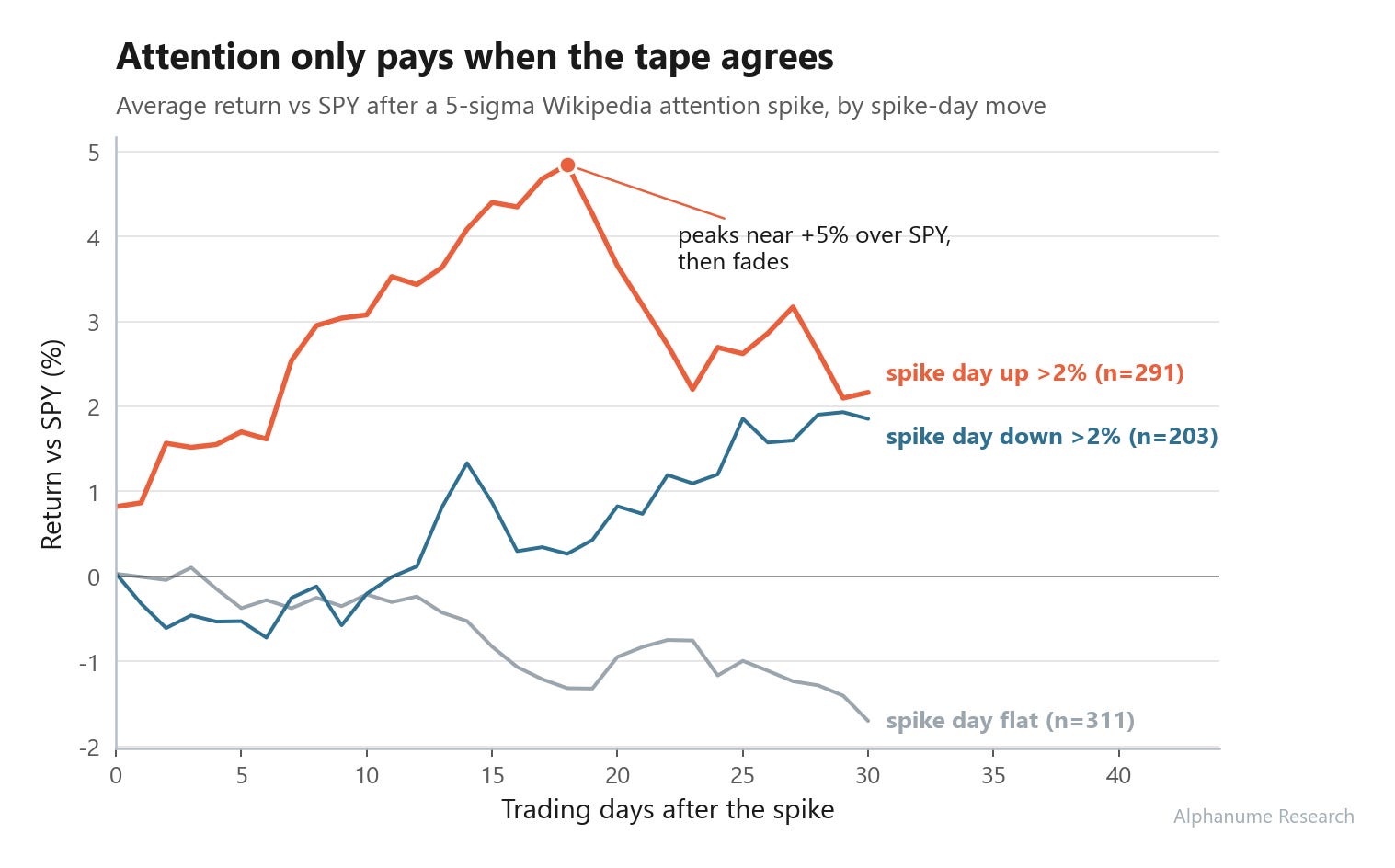
The biggest finding was that same-direction momentum exists for names that experience a spike in attention.
For instance, of stocks with attention spikes that were up >= +2% on the day of the spike, they often returned +3.1% over SPY within 10 trading days across 291 events.
Run it yourself
Everything above comes from the public API, and each strategy is maybe an afternoon of work to reproduce:
Pull a year of events from the feed you care about, say
GET /v1/de-spac-events, and grab daily bars for each ticker from your price vendorEnter at the next open after each event date, mark 30 trading-day closes, and dedupe repeat events (e.g., drop_duplicates())
Apply sanity checks (e.g., $1 price minimum, $100k average volume minimum)
Compute the mean path, the median, and the hit rate, and look at the worst five events by hand before you believe any of it
Final Thoughts
We made this post after sitting down and trying to look at our old posts from the perspective of someone else in the space.
Although we love to run strategy research and publish our findings, we feel that it’s important to at least check-in from time-to-time to make sure what we ship actually works.
If you’d like to get to the point where an afternoon of this is routine, that’s exactly what we built Alphanume Learn for. Every strategy in this post lives in the curriculum (the dilution short, the SPACs, momentum, the earnings premium), shown the same way we just did it here: pull the data, test the claim, look at what the worst events did.
As always, thanks for reading, and we’ll see you in the next one.
Thank you very much!
Have you also revisited your crypto momentum strategy that you presented last year (I think)?
As far as I know, it doesn’t run under your “Alphanume” brand and there’s no API/interface for it, so it probably wouldn’t have been a good fit for the current article. But perhaps you could share an update on it at some point via your Quant Galore account on Medium, if you feel like it.