

Spend enough time in the options market and you eventually stumble into an age-old question:
“The night before every earnings report, the options market publishes a forecast of how far the stock is about to move. But is that forecast any good?”
That question has been sitting in our research notes for a while, and it turns out to be one of the cleanest studies you can run with public data.
It’s a strange forecast to begin with. No analyst signs it, nobody defends it on CNBC, and it’s backed by real money on both sides.
It also gets graded automatically. The report drops, the stock moves, and the forecast was either too big or too small. Every quarter, for every listed name, forever.
Yet almost nobody keeps score. Sell-side analysts get their price targets mocked on Fin-Twit every quarter, economists get their CPI calls stomped within seconds of the print, but when was the last time someone overpaid for vol and called for a brand new options pricing model?
So today we’re going to walk through this little corner of the derivatives business, end to end, the same way we’d run any event study on the desk.
It’s Essentially a Betting Line
The forecast lives in the ATM straddle: the call and the put at the strike nearest the stock price, bought together.
Say a stock trades at 100 the afternoon before it reports, the ATM call costs 2.60 and the ATM put costs 2.40, so the straddle costs 5.00.
Whoever buys it makes money only if the stock ends more than 5 points away from 100, in either direction. Whoever sells it keeps the premium only if the stock stays inside that band.
Divide the straddle by spot and you get the break-even as a percentage:
5.00 / 100 = 5%
That ratio is the implied earnings move: the size of move at which straddle buyers and straddle sellers both walk away flat.
The reason we call it a forecast is that it gets set exactly the way a betting line gets set:
If traders collectively believed the stock would move 8% on the print, a 5.00 straddle is free money and they’d buy it until the price rose.
If they believed 2%, they’d sell it until the price fell.
The price settles where the marginal buyer and the marginal seller cancel out. A live, money-backed consensus estimate of the move’s magnitude.
There’s also a mechanism-first reason to suspect the line might sometimes be off:
Market makers are obligated to quote through the event, and every quarter a reliable crowd shows up on the other side: hedgers protecting positions through the print, and speculators buying the straddle as a lottery ticket.
Someone has to warehouse all that demand, and warehousing risk you can’t hedge away commands a premium. That premium lives inside the straddle price, which means it lives inside the forecast.
A suspicion isn’t a result, though, so let’s see what the data actually says.
Don’t Botch the Clock
The first rule of the loop we run on every event class: write the hypothesis down before touching data, precisely, so the data can’t seduce you into testing a prettier claim later.
Hypothesis: The earnings move implied by the options market is, on average, larger than the move that gets realized.
Yes/no answer, with a clean, measurable magnitude.
Now, when working with earnings data, it’s especially important to make sure you’re tracking the clock.
Earnings come in two flavors, bmo (before market open) and amc (after market close):
The capture date is the last session that closes before the announcement. That close is where the straddle still contains the full event premium, so it’s where the implied move gets read.
The reaction date is the first session that trades after the announcement, the one that absorbs the move.
For a company reporting amc on Tuesday: capture Tuesday, reaction Wednesday. For a company reporting bmo on Tuesday: capture Monday, reaction Tuesday, because by Tuesday’s open the answer is already out.
This is why we like event datasets that carry the alignment explicitly. In the earnings-move-history data we use, every row is one event stamped with its timing (bmo or amc), its capture date, and its reaction date, alongside implied_move_pct and realized_abs_move_pct measured at exactly those moments.
Was the Market Right?
With the clock handled, the measurement is pretty straightforward.
The core metric to track is the implied-minus-realized spread, event by event:
events["spread"] = events["implied_move_pct"] - events["realized_abs_move_pct"]

print(f"Events:      {len(events)}")
print(f"Mean spread: {events['spread'].mean():.2f}pp")
print(f"Hit rate:    {(events['spread'] > 0).mean():.1%}")
Three numbers, and each one earns its place:
Event count tells you whether you have evidence or an anecdote. Eight events is a story; several hundred is a distribution.
Mean spread is the headline: on average, was the forecast an overestimate?
Hit rate tells you the distribution of outcomes. A positive mean driven by 55% of events is a very different animal from one driven by 90%.
Run this across broad universes of liquid names and you land on the population verdict: the implied move has historically tended to overshoot the realized one. The line runs rich, on average, exactly the way the warehousing story predicts (chart below).
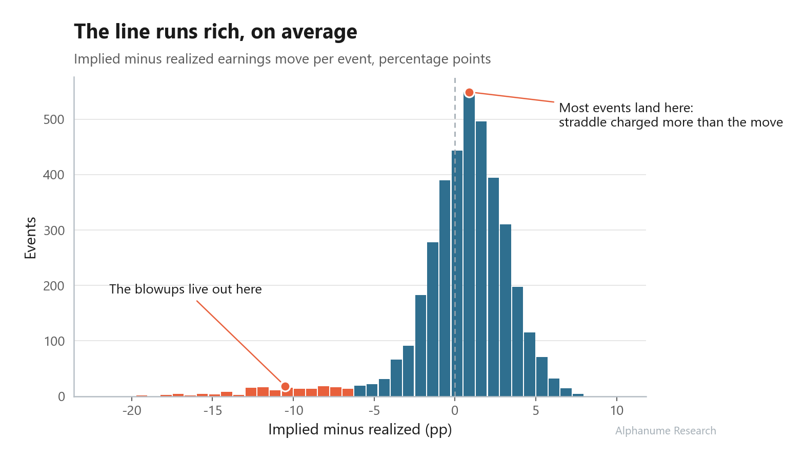
Interestingly enough, this is where most write-ups stop, declare victory, and back into a short-straddle strategy.
It’s also where the study starts getting good, because a population average is a blunt instrument. It says the crowd overpays on average, but it says nothing about who.
Okay, So Who?
Some names overprice their own earnings move nearly every single quarter: the street buys the straddle, the report drops, and the stock moves half of what was priced in. Other names, far rarer, keep delivering more than the market priced.
So, the question narrows from “does the market overpay?” to “who does the market chronically overpay for?”
In the dataset, every event row carries the name’s running record as of that event:
n_events_to_date: how many events are on record.hit_rate_to_date: the share of past events where implied overshot realized, on a 0 to 100 scale.avg_over_under_to_date: the trailing average of implied minus realized, in percentage points.overpriced: the outcome on this specific event.
Now, the _to_date suffix is doing more work than it looks like:
Each row’s running stats are computed only from events up to and including that row’s date, then frozen into the row forever.
Which means a backtest that ranks names by
hit_rate_to_dateon some historical date is ranking on exactly the information a trader standing on that date could have had. Look-ahead bias, the classic backtest sin, is designed out of the data from the start.
Reading the records, you’re looking for three things at once (chart below):
A high hit rate, say above 75. The straddle overshoots most quarters, habitually.
A bias big enough to survive costs. A +0.2pp (percentage points) average is real but untradeable after spreads; a +2pp average is a different conversation.
Enough events to believe it. Roughly 12 or more, three years of quarters. A perfect record over 4 events is a coin that came up heads four times.
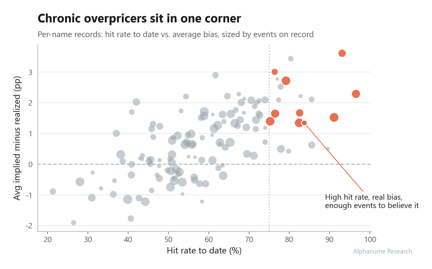
A name that clears all three is what the market calls a chronic overpricer: the market keeps buying its event insurance rich, quarter after quarter, and the record says so in writing.
The public snapshot begins in 2024, so no name yet clears that 12-event conviction floor. Using a deliberately looser eight-event floor only to show what the live ranking produces, the top three candidates in this snapshot were:

Final Thoughts
Notice what never happened in this walkthrough: nobody predicted a single quarter. The entire edge came from being the one who bothered to grade the forecast.
Everything to this point gets you a list of suspects, though. Turning that list into a position is its own discipline: checking whether a name is charging its usual rich price right now, gating the watchlist ahead of the reporting week, and attacking whatever survives for the tails, regimes, and costs that can erase a +2pp edge.
We go substantially deeper into that discipline, deploying this exact study into a trade, in Module 5 of Alphanume Learn: you build the chronic-overpricer tally and the full pre-earnings screen yourself, live in the browser, against the same dataset we just used.
Learn is the series we created to be the first of its kind: an interactive quant curriculum that goes genuinely deep into systematic, event-driven trading. Twelve modules, one research loop, run on volatility, 0-DTE, dilution, de-SPACs, defaults, and the rest of the catalog.
Module 1 is free, and the full course is included with Alphanume Pro ($99/month).
As always, thank you for reading, and we hope to see you in the next one.